The Science and Art of Color Psychology for Your Home
How to Use Color Psychology to Create a Home That Feels as Good as It Looks
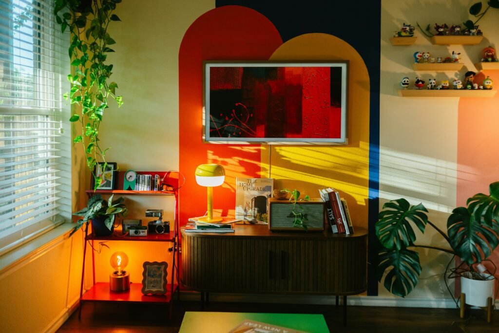
Your home is more than just four walls and a roof, it’s your emotional haven, your sanctuary, and honestly, your biggest reflection of who you are. And one of the most powerful (yet underrated) tools you have to shape how that space feels? Color.
Color psychology is basically the study of how different hues influence our emotions, behaviors, and even our physiology.
A Brief History of Color Healing
Color hasn’t always been just an aesthetic choice. Ancient Egyptians used colored minerals and stones in their healing practices, and Eastern traditions have long incorporated color into chakra balancing and energy work. This practice, known as chromotherapy or color healing, is based on the idea that different colors emit specific energy frequencies that can influence our physical and mental states.
What Does the Research Actually Say?
Here’s where things get interesting, and a little nuanced. While there’s a ton of anecdotal evidence and historical practice around color psychology, modern clinical research is still catching up. Some studies show clear correlations between color and mood, while others point out that the placebo effect plays a huge role.
Translation? If you believe a certain color will calm you down, it probably will. Your personal associations and cultural background matter just as much as any universal “rules.” That said, there are some consistent patterns that researchers have noticed across different populations.
The Technical Stuff: Tints, Shades, Tones, and More
Before we get into which colors do what, let’s quickly decode some color theory lingo. Understanding these terms will help you talk to paint store employees like a pro and make more intentional choices for your space.
- Tint: Adding white to a color to make it lighter (think: pastel pink from red + white)
- Shade: Adding black to a color to make it darker (like: burgundy from red + black)
- Tone: Adding gray to a color to mute or soften it (example: sage green from green + gray)
- Value: How light or dark a color is overall
- Saturation: How intense or rich a color appears
Why does this matter? Because a highly saturated red feels very different from a muted, grayed-out red. Same hue, totally different energy.
Your Body on Color
Believe it or not, colors can trigger actual physiological responses. Warm colors like red and orange have been shown to increase heart rate, blood pressure, and even respiration in some studies. Cool colors like blue and green tend to do the opposite, they can lower blood pressure and create a sense of calm.
This isn’t just “in your head.” Your nervous system is literally responding to the visual information it’s receiving from your environment.
Stress, Anger, and Emotional Regulation
Creating a soothing environment with the right colors can be a legitimate tool for managing daily stress and even aggression. Soft blues, greens, and lavender have been associated with reduced tension and a greater sense of peace. If you’re dealing with high-stress work or family dynamics, strategically using these colors in your bedroom or relaxation spaces can make a real difference.
Sleep and Circadian Rhythms
Here’s a big one: blue and green light (the kind you get from screens and some LED bulbs) can actually suppress melatonin production and keep you alert. On the flip side, warmer tones like red and amber light don’t interfere with melatonin as much, which is why they’re better for evening routines and bedroom lighting.
When it comes to wall colors, soft blues and greens in the bedroom can promote relaxation and better sleep quality, while bright yellows and oranges might be better saved for morning spaces like kitchens.
Beating the Winter Blues
If you live somewhere with long, dark winters, you might be familiar with Seasonal Affective Disorder (SAD). Bright, cheery colors can actually help combat those “winter blues” by elevating dopamine levels and creating a sense of warmth and energy. Think sunny yellows, warm oranges, or even vibrant accent walls in spaces where you spend a lot of time during darker months.
The Emotional Spectrum: A Color-by-Color Breakdown
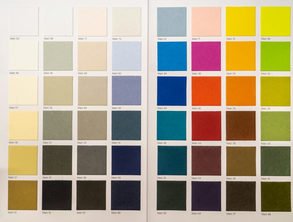
Let’s get into the fun part, what each color actually does emotionally and where it works best in your home.
Warm & Energetic Tones
Red
- Emotions: Passion, strength, energy, appetite stimulation
- Best use: Accent walls, dining rooms, or anywhere you want to create excitement
- Caution: Too much red can feel aggressive or overstimulating—use it in small doses
Orange
- Emotions: Friendly, welcoming, revitalizing, creative
- Best use: Living rooms, kitchens, home offices where you want energy without the intensity of red
- Bonus: Orange is said to boost oxygen flow to the brain, which can enhance mental activity
Yellow
- Emotions: Optimism, joy, intellect, warmth
- Best use: Hallways, kitchens, breakfast nooks—anywhere that needs a light boost
- Note: Yellow reflects light beautifully, making it perfect for dark or narrow spaces
Cool & Soothing Tones
Blue
- Emotions: Serenity, focus, trust, calm
- Best use: Bedrooms, home offices, bathrooms
- Science: Blue has been shown to reduce tension and even lower blood pressure in some studies
Green
- Emotions: Growth, balance, harmony, connection to nature
- Best use: Living rooms, bedrooms, anywhere you want a restorative vibe
- Bonus: Green is the most “biophilic” color—it literally connects you to the natural world, which has its own mental health benefits
Purple
- Emotions: Imagination, spirituality, luxury, creativity
- Best use: Bedrooms (especially lavender shades), creative spaces, meditation rooms
- Note: Lighter purples like lavender promote hope and calm, while deeper purples feel more dramatic and regal
The Psychology of Neutrals
Pink
- Emotions: Kindness, love, compassion, nurturing
- Best use: Bedrooms, bathrooms, or anywhere you want a gentle, calming energy
- Interesting fact: Pink has been shown to reduce physical signs of aggression in some settings
Brown
- Emotions: Grounding, stability, security, warmth
- Best use: Living rooms, studies, or as a grounding element in any room
- Note: Brown works beautifully as a furniture or wood tone, but can feel heavy as a wall color if not balanced with lighter elements
Gray
- Emotions: Maturity, sophistication, neutrality, calm
- Best use: Backdrop color in modern spaces, home offices, or as a secondary color
- Caution: Too much gray can feel “dampened” or emotionally flat—balance it with warm accents or textures
White
- Emotions: Purity, cleanliness, new beginnings, spaciousness
- Best use: Small rooms, bathrooms, kitchens, or anywhere you want to maximize light
- Note: White expands spaces visually, but can feel sterile without texture or warmth layered in
Black
- Emotions: Elegance, power, sophistication, drama
- Best use: Accent pieces, trim, or small doses in modern spaces
- Caution: Large amounts of black can feel heavy or even negative—use it intentionally and sparingly pmc.ncbi.nlm.nih
The Kitchen: Energy and Appetite
Your kitchen should feel energizing and inviting. Warm colors like yellows, oranges, and soft reds are perfect here because they stimulate appetite and create a lively, social atmosphere. Think: a sunny yellow backsplash, orange accent stools, or warm-toned wood cabinets.
The Living Room: Connection and Comfort
This is your social hub, so you want colors that encourage conversation and relaxation. Warm neutrals (like beige, cream, or soft gray with warm undertones) create a welcoming backdrop, while calming greens promote family relaxation and connection.
The Bedroom: Your Five-Star Retreat
Your bedroom should feel like a luxury hotel spa. Soft blues, lavenders, and sage greens are ideal for promoting rest and reducing stress. Avoid bright reds or oranges here, they’re too stimulating for a space dedicated to sleep and recovery.
The Home Office: Focus and Creativity
You want a balance of productivity and creative flow. Blues enhance focus and concentration, while greens promote balance and reduce eye strain. If you’re in a creative field, a touch of yellow or orange can spark innovation without being overwhelming.
The Bathroom: Spa-Inspired Sanctuary
Transform your bathroom into a mini-retreat with whites, teals, or seafoam greens. These colors evoke cleanliness, water, and tranquility, perfect for your morning routine or evening wind-down.
The Dining Room: Intimacy and Conversation
Rich, deep colors like burgundy, navy blue, or forest green create an intimate, cozy atmosphere that encourages lingering conversations. These colors absorb light and make the space feel more enveloping and special.
Space Perception and Depth
Colors can literally change how big or small a room feels:
- Light colors reflect light and make rooms feel airy and expansive, perfect for small spaces or rooms with low ceilings
- Dark colors absorb light and create “enveloping,” cozy spaces, great for large rooms or when you want intimacy
- Warm colors (reds, oranges, yellows) “advance,” making walls feel closer
- Cool colors (blues, greens, purples) “recede,” making walls feel farther away
The 60-30-10 Rule
This is a classic design principle for visual harmony:
- 60% dominant color (usually walls or large furniture)
- 30% secondary color (upholstery, curtains, rugs)
- 10% accent color (pillows, art, accessories)
This ratio keeps your space balanced without feeling matchy-matchy or chaotic.
Natural vs. Artificial Light
Lighting changes everything. A color that looks perfect in the store might look completely different in your space. Always test swatches under your actual lighting conditions, both natural daylight and your evening bulbs.
Room Orientation Matters
The direction your room faces changes the quality of light it receives:
- North-facing rooms: Get cooler, bluer light. Balance this with warm, creamy yellows or peaches to avoid a cold feel
- South-facing rooms: Get intense, warm sunlight. Use cool tones to prevent the space from feeling “overheated”
- East-facing rooms: Get bright morning light that fades by afternoon
- West-facing rooms: Get golden afternoon and evening light
Practical Implementation: Step-by-Step Selection
1. Determine the Purpose
What’s the primary activity in this room? Cooking? Sleeping? Working? Socializing? Let function guide your color choice.
2. Define the Desired Feeling
Ask yourself: “How do I want to feel in this room?” Calm? Energized? Creative? Intimate? Write down 2-3 emotions and let them guide your palette.
3. Select a Scheme
Choose one of these classic color relationships:
- Monochromatic: Different shades of the same color (e.g., light blue, medium blue, navy)
- Analogous: Neighboring colors on the wheel (e.g., blue, blue-green, green)
- Complementary: Opposite colors for contrast (e.g., blue and orange, but use one as the dominant and the other as an accent)
4. Incorporate Texture
Color isn’t just about paint. Balance it with materials like velvet, wood, linen, metal, or plants to add depth and interest. Texture keeps a monochromatic scheme from feeling flat.
5. Test with Swatches
Paint large swatches on multiple walls and observe them at different times of day. Colors shift dramatically with changing light, so give yourself at least 2-3 days to see how they behave.
Common Pitfalls and Global Considerations
Ignoring Undertones
This is the #1 mistake. A gray with pink undertones will clash with furniture that has blue undertones. Always identify the undertone (warm, cool, or neutral) and make sure it complements your existing pieces.
Over-Matching
Your throw pillows don’t need to be the exact same shade as your walls. Aim for complementation, not mirroring. A little variation creates a more natural, lived-in feel.
Cultural Sensitivity
Color meanings aren’t universal. For example, white symbolizes purity and new beginnings in Western cultures, but it’s associated with mourning in some Asian cultures.
Painting Your Purpose
At the end of the day, color is a tool for shaping your physical and mental well-being. The research is clear: the colors you surround yourself with can influence your mood, your stress levels, your sleep quality, and even your productivity.
But here’s the most important takeaway: your personal associations matter more than any general “rules.” If a certain color makes you happy, use it, even if the “experts” say it doesn’t belong in that room. Your home should reflect you, not a textbook.
Happy painting!